You know that moment when someone you’ve known for years shows up with a new haircut, new outfit, and a whole new energy? That’s basically what just happened with Blueline. They’ve been doing big things in the learning space for a while now with their AI-powered simulations, so it was only a matter of time before their website needed to catch up.
We built the original site a few years ago, and it served them well. But Blueline has evolved since AI-powered everything splashed onto the scene. Their offering is more focused, their platform more powerful, and their clients are engaging with them in new ways. The brand needed a refresh because the business had outgrown it.
The shift: From full-service L&D to a simulation-first mindset
For years, Blueline worked across the broader learning and development space. But now, Blueline has repositioned around what they do best—simulation-based learning that’s human, high-impact, and surprisingly personal for AI. And once that clarity clicked internally, the website needed to reflect it externally.
What we did (and why)
Behind every clean, modern website is a whole lot of invisible work. What you see (design, copy, layout) rests on everything you don’t (clearly articulated value proposition and target audience, SEO setup, site structure, functionality). For Blueline, that meant everything from clarifying their value proposition and refining their brand to drafting metadata, testing forms, and running quality checks before launch. Along with following our standard website development process for Blueline, we focused on:
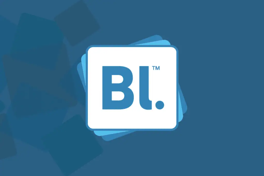
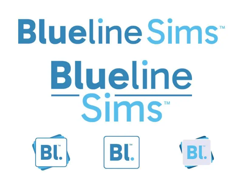
- Consulting on new branding: Blueline’s internal design team created a new logo and visual identity with guidance from our branding expert
- Simplified structure: The new site is clean and intuitive with fewer pages and tighter navigation, making it more user-friendly and helping visitors understand what Blueline does straight away.
- Targeted website copy: Clear, concise messaging that removed jargon and spotlighted Blueline’s core offering.
- Content cleanup: Blueline had built a strong library of thought leadership, but not all of it still served them. We evaluated hundreds of legacy blog posts and only migrated those that were ranking or still relevant.
- Strategic CTAs: The new site guides users straight to action with the ‘REQUEST A PRIVATE DEMO’ call to action in the attention-grabbing orange accent color.
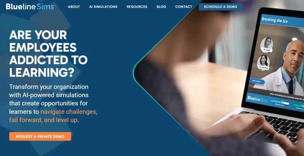
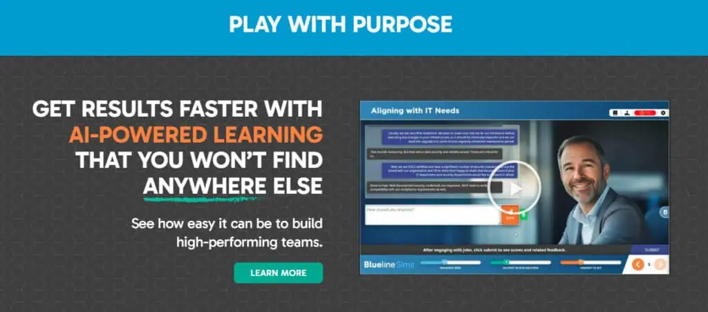
- Visual storytelling. We leaned into video, motion, and imagery to show the simulations in action.
- Lead-gen tools. We added two high-value resources that position Blueline as experts while growing their email list.
The result: everything clicks
The new site looks great, yes. But more importantly, it feels like the new Blueline, and it’s more focused on what they actually want to be known for.
Here’s how Blueline’s Managing Partner, David Milliken, summed it up: “The site tells a powerful story of who we have become, shows off our new brand beautifully, and is a testament to our collaboration. I’ve never been more proud of our company, our brand, and our presence!”
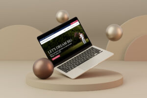
See the transformation
Want to see what a website glow-up looks like when it’s done right? Have a look at the new Blueline site here.
And if your business has evolved but your website hasn’t? Let’s fix that.
More before & after stories
- Before & after brand refresh for John Merrill Homes
- Before & after branding for Lauren Fours Properties
You may also be interested in: Don’t Launch It and Leave It: Here’s why you need a website maintenance plan