
Building a website like Amazon’s is very different from building a website like Brighter Messaging’s. Where Amazon offers millions of products, we offer a few core services. The massive size of the Amazon website necessitates a different approach to navigation. For large websites with multiple products or categories, mega menus can help improve website usability—if they are designed with care, that is.
Jump to a section:
When should you use a mega menu?
How do mega menus work on mobile?
Should you use a mega menu on your website?
Still unsure about using a mega menu?
What is a mega menu?
A mega menu is a large, expandable website navigation menu that displays multiple categories, subcategories, and links in a single panel. Unlike traditional drop-down menus, mega menus organize large amounts of content using columns, headings, icons, and images, helping users quickly find information on complex websites.
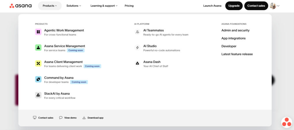
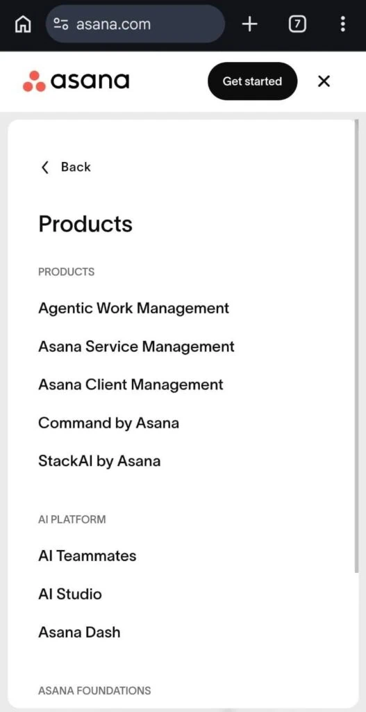
Here’s an example from work management platform, Asana:
More mega menu examples
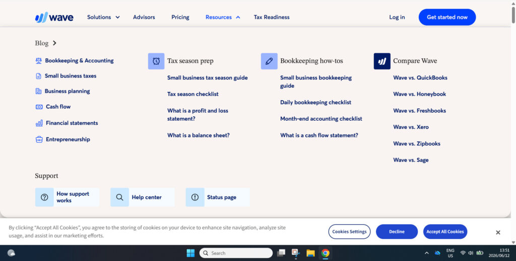
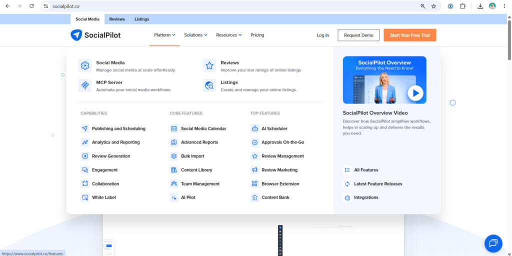
Here are some more examples of how a mega menu can work (based on our best apps for small business owners)
Wave mega menu
SocialPilot mega menu
Mega menu vs dropdown menu
What makes a mega menu different from a standard drop-down menu?
- Consists of one or more large panels divided into groups for better navigation
- The navigation panel is structured using typography, layout design, icons, and even images
- All the main pages or categories are visible at once
| Feature | Mega menu | Drop-down menu |
| Number of links | High | Low to moderate |
| Layout | Multi-column | Single column |
| Images and icons | Yes | Usually no |
| Best for | Large websites | Small websites |
| Mobile usability | Requires customization | Generally simpler |
| SEO impact | Can improve site architecture | Easier to manage |
What features can be added to a mega menu?
- Pictures and videos
- Maps
- Transition effects
- Slider function
- Carousel feature
- WordPress widgets
- Background images
- Popup forms
- Post grids
- Search boxes
- Tabbed menus
- Customized location settings
The list above is by no means exclusive; mega menu developers are constantly competing with one another to create even richer mega menu experiences.
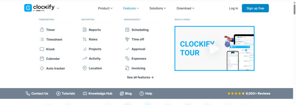
Here’s an example of a video in Clockify’s mega menu:
When should you use a mega menu?
We asked experienced web consultant Rachel Cardy about when a mega menu is a good idea: “I think it depends on the complexity of the website, and how quickly you want a person to get to what they need. For example, for a day spa, you might use a mega menu so that the person can see all the options at once, getting them to the service or category or services they are looking for quickly. A traditional menu might work, but you might have 2-3 levels of clicking, which isn’t great for accessibility. For a luxury hotel, you might use a mega menu so the user can choose between the rooms, dining, spa, or concierge services, all with visuals to enhance the luxury feeling. E-commerce is another common use for mega menus due to all the categories and subcategories.”
Benefits of using a mega menu
For a complex website with a large library of content, a mega menu is a great way to help draw users’ attention to the most relevant parts of the site. It can also serve as a way to highlight limited-time offers, events, and other special elements. Generally, the goal is to improve the user experience.
Improve how users navigate a site
A traditional drop-down menu with lots of content will require the website user to scroll up and down, which takes longer, puts more strain on their short-term memory, and can be confusing. On the other hand, showing your entire website’s navigation in a single mega menu helps visitors navigate directly to what they are looking for. With no scrolling required, everything is visible at once, and there’s no need for users to drill down into further sub-navigations.
Helps users find more, so you can sell more
By displaying your full offering on one pane, you could generate more awareness and sales by encouraging users to explore deeper into the site and keep browsing for longer.
Mega menus are more organized
Mega menus assist with SEO rankings by grouping subpages and keywords and creating a stronger and more logical site architecture. With multiple categories and subcategories, mega menus also help users find the content they want more quickly. In a standard sidebar navigation menu, on the other hand, a user may not always realize which tab they should click on to access specific types of information about your products or services.
The ability to add icons, images, and other rich features
Mega menus allow you to use icons, images, and other features to make the subcategories more recognizable. Using visual cues helps users find specific types of content even faster and makes the site look more visually appealing.
But there’s a significant caveat—to realize these benefits, the mega menu must be designed properly; otherwise, it can turn into a mega mess.
Disadvantages of mega menus
Mega menus aren’t for everyone:
- When the mega menu is expanded, users can’t see what’s under it
- Many mega menus overwhelm the user with choice, leading them to suffer from cognitive overload
- Putting too many links at the top of the page can be bad for SEO. Google’s Webmaster Guidelines recommend that web admins keep the links on a given page to a reasonable number and avoid creating complex webs of navigation links
- Having a massive collection of links in the navigation can slow load times and rendering
- If your site doesn’t have a lot of content, making a mega menu is probably overkill
- Can create accessibility issues for screen readers
- One of the major downsides of mega menus is that they’re typically not mobile-friendly
How do mega menus work on mobile?
Mega menus on mobile need to be handled with extra care and caution. A mega menu designed for desktops will almost always need to be reimagined for mobile responsiveness, which creates some design and development challenges. Even with a significant redesign, mega menus don’t always work very well on mobile due to rendering issues or taking up too much screen real estate. With limited space on small screens, getting mega menus right can be a challenge. In most cases, you’re better off with a hamburger menu, which looks sleek and still allows you to showcase several links.
“Mega menus can work on mobile too, just have to build them to be responsive and be aware that the screen is much smaller, so not as much will fit. You have to prioritize what comes first,”
Rachel says.
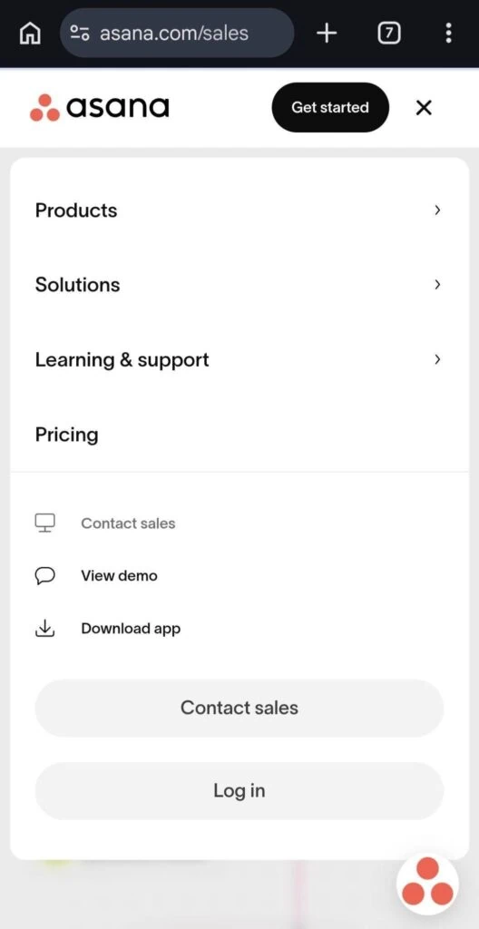
Here’s how Asana’s mega-menu looks on mobile:
Mega menu best practices
If you’re going to use a mega menu, take care with the way you design and organize links. Be sure to consider the information hierarchy from the user’s point of view.
- Don’t inundate users with too many options
- Create clear and logical category groupings
- Create prominent labels that can easily be scanned
- Use simple, explicit labels that convey the nature of each group
- Use 5-7 items in each category
- Create visual separation between groups
- Question the inclusion of every item
- Keep your mega menu as minimalistic as possible
- Have a professional web developer design your mega menu
Should you use a mega menu on your website?
The use of mega menus should be evaluated based on your business goals, along with your ability to provide the resources available to properly implement, customize, and update them.
Key questions to ask:
- Does the mega menu improve your site’s navigation?
- Does it meet the objectives of your website?
- Do you have a large and complex product offering?
- Do you have the resources to properly design and implement a mega menu?
| A mega menu may be appropriate for you if: | A mega menu may NOT be appropriate for you if: |
| A user is expecting to use a mega menu for similar sites in your industry (e.g., e-commerce) | Your site doesn’t have a lot of links |
| You have too many options for a drop-down menu | Your homepage already contains numerous links to subpages |
| You want to showcase your full offering | You want to direct traffic to a specific page |
| You have the resources to design and develop an effective, user-friendly mega menu. | You don’t have the ability to customize or create a different menu for mobile |
Still unsure about using a mega menu?
Contact Brighter Messaging today for a free consultation. Our experienced team is highly skilled at creating user-friendly websites that deliver results.
FAQs about mega menus
What is a mega menu?
A mega menu is a large navigation panel that displays multiple categories and links at once, helping users navigate large websites more efficiently.
Are mega menus good for SEO?
Mega menus can support SEO by improving site architecture, internal linking, and user navigation. However, poorly designed mega menus can create excessive links, slow page speed, and hurt usability.
When should you use a mega menu?
Mega menus are best for websites with large amounts of content, multiple product categories, or extensive service offerings.
What is the difference between a mega menu and a drop-down menu?
A traditional drop-down menu displays a single vertical list of links, while a mega menu displays multiple categories and links in a larger panel with columns, headings, images, and icons.
Are mega menus mobile-friendly?
Mega menus can be adapted for mobile devices, but they usually require a different design approach, such as accordion menus or hamburger navigation.